I had a go at making the blog more visual today. Checked the Internet and…
Mimbo
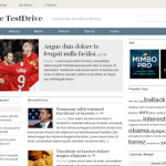
 Writing about the genius behind the WordPress theme (i.e layout) for my blog is long overdue. The theme is developed – and more importantly: supported – by a guy named Darren Hoyt. I found his theme on the ‘net and liked its navigation and its simplicity, see blog ‘found a layout‘. Pic is from Darren Hoyt’s web page that I visited just now in hopes to get info about fixing a bug. There are little
 ![]() that have appeared on my blog at the top of each ‘archive’ page. For example when you click ‘writing the blog’, the archive header has them. I don’t want them, don’t know where they came from and why. Was it my blogging about RSS feeds? Anyway, they led to an error message instead of to a feed page. If the
that have appeared on my blog at the top of each ‘archive’ page. For example when you click ‘writing the blog’, the archive header has them. I don’t want them, don’t know where they came from and why. Was it my blogging about RSS feeds? Anyway, they led to an error message instead of to a feed page. If the ![]() is annoying because unwanted and ugly, the error message is more annoying because it is a loose end.
is annoying because unwanted and ugly, the error message is more annoying because it is a loose end.
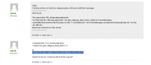
In hopes to find a fix for this problem I visited Hoyt’s website just now, and what do you know: it has a forum functionality where Mimbo afficionado’s discuss its minor failings. On the forum, I found this fix:

And it worked! Not that I know what it is all about, I just copy-pasted the bugfix really carefully into my code, and it works! No error message any more. What one
gets now is only marginally better: a page of unreadable text. This is not pleasing in its visual quality either, but I work from the assumption that people that are used to RSS feeds will know what to do with it.
Note: find a way to get rid of these icons. Note: find out myself what to do with the RSS page.
| « [30!] variations | <-- previous post | next post --> | Gentrification » |
|---|


