While I went to Amsterdam a little while ago for other purposes, by chance I went past…
A room with a view
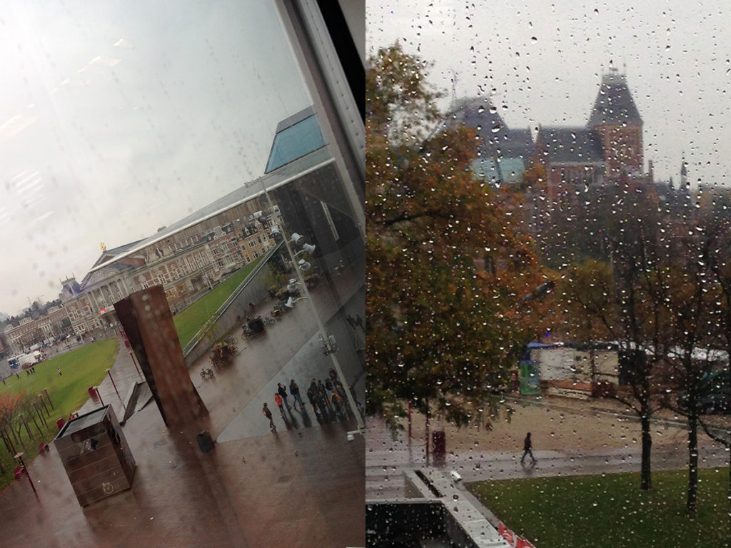
A room with a view – we met for dKvhT purposes in the boardroom at the Van Gogh Museum this week. The weather was rotten, but what a view!
To be seen from the Van Gogh boardroom:
– Stedelijk Museum, we see the corner of the Stedelijk Museum building and a row of people at the entrance
– Concertgebouw, the classical building right behind the work in corten steel by Richard Serra
– the Rijksmuseum, the domes in the background on the second picture.
Temples for higher culture each and every one! In my next life I’ll live in Amsterdam, in a houseboat on one of the canals and within canoeing distance of the public library, the beautiful OBA building on the OosterdokIsland. Were I do training and gorge on books.
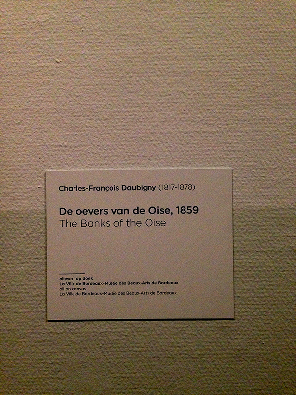
We had a great lecture about project management at the Van Gogh by one of the two project managers they employ. We also toured the exhibition ‘ Daubigny, Monet, Van Gogh’ with curator Edwin Becker and focused on the strategy behind the design, colour scheme and lighting.
A few of the things I picked up:
– a colophon is best placed at the entrance – people skip it when placed at the end;
– the wall was horizontally divided using a darker and lighter shade of a pistache-like color. Done to break up the great height of the walls. I only noticed it when Edwin pointed it out – very subtle.
– visitors like open spaces better than small ones – they don’t like a labyrinth;
– an entree is needed to gather the visitors into the exhibition. It is to tell a story about the artist(s), but a simple timeline isn’t interesting enough. The timeline was at the entree to the second floor;
– lighting was pretty low (find more here). Van Gogh’s paintings get 70 lux, other paintings go even lower. This has to be negotiated with the people that give the picture on loan. Also a safety plan (which pictures get rescued first when the museum is on fire?);
– minimum viewing distance for paintings is roped off;
– drawings are behind glass and can be seen from up close (obviously, they need to be seen from up close);
– optimum height for hanging is 1.60, a little more is also good as pictures are best seen from below;
– dilemma: how do people find their way from first floor to second floor. The Van Gogh museum architect did them no favours here – there is no natural flow up the stairs. They now blanked the view through the first-floor doors to the reception area, and hope this helps to get more people up the stairs (do they use mystery shoppers?);
– check how wheelchair-bound people can see the exhibition.
| « x²+y²=r² | <-- previous post | next post --> | On a rainy day …. » |
|---|
