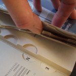
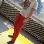
From the assignments Joost Grootens formulated when starting his workshop, Loes and I chose to…
Joost Grootens & visual indexing
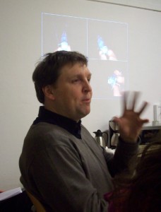 Had a lecture last monday by Joost Grootens, who specializes in designing architecture books and atlases and is the head of Studio Joost Grootens. He has won numerous prizes for his designs, among them the 2009 Rotterdam Design Prize.
I had attended a lecture by him before, last september at the MaHKU Editorial Design presentations 2009. It all came back to me seeing Joost’s first slide, which is also featured on his site, a picture of his austere and very, very organised workspace in Amsterdam. It made me wonder if his mind works like his workspace looks. And if so, how my workspace reflects my mind. I have a lot more clutter, and colour too…..
Anyway, his lecture was very very interesting. Especially the work he did on atlases (Vinex, Metropolitan World and others). As I used to be a surveyer, my job was to present cartographers with the measurements enabling them to make maps that represent the world with (any degree of) precision. So seeing how Joost presents his data in a visual and intuitive way was very interesting to me. I like his fanatical attention to detail and the energy and enthousiasm he conveys for his topic.
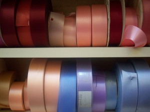
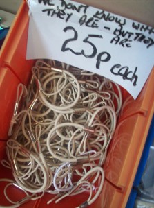
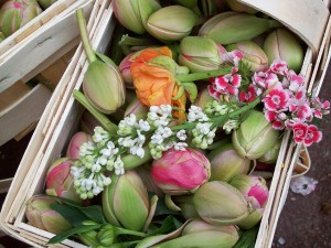
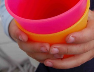
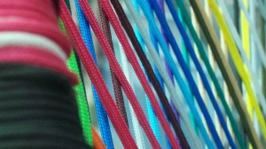
The assignment we got is to do a visual index of either our e-mail account, a book, or the building of HKU at the Ina Boudier-Bakkerlaan. I will work with Loes Glandorff, who does a masters in Interior Design. We’ve decided to do a book index and will start today by choosing a suitable book. Tomorrow we will meet at the IBB laan and start designing our index. Looking forward to this, as I’ve always been very attracted to categorisiations and things that have been placed according to a system. I can look with satisfaction upon a market stall that sells zippers and thread for sewing and buttons and such, I love the order and neatness of their displays. One of my best days ever was spent at an english haberdashery wallowing in ordered rows of coloured buttons, fabric, ribbons and such. I will post a few pics I made at this shop here to illustrate my infatuation. And why not add a few more market stalls and coloured rows while I am at it?
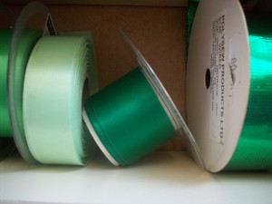
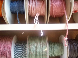
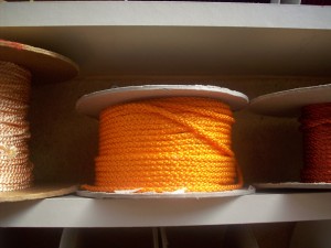
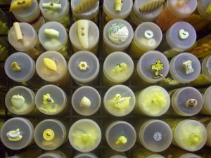

| « Lights out for the Domkerk proposal | <-- previous post | next post --> | Meschac Gaba’s Salle de Jeux » |
|---|
