Went and visited the Singer Museum in Laren to see the new museum garden made…
More is more

Did I mention being on holiday? Well, I am. We’re spending one week in the mountains south of Lake Geneva, in a chalet with a world-class view over the mountain range toward said lake. Swimming, walking, sight-seeing (Mont Blanc, stunning!), reading, eating good food and sleeping a minimum of 10 hours a night. Must have been due some R&R …..
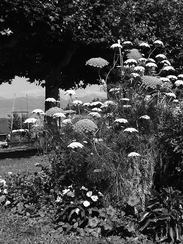
Slideshow includes some images taken at the lakeside, where a number of villages have competed for the appelation ‘village fleuri’ – a competition that has done wonders for floral France. Of course we instantly turned ourselves into jury members and created bogus rules …. which was fun. Noticed that my tastes must have shifted – a few years ago I would have found plant combinations like these tasteless, but I’m coming around to the ‘more is more’ school of thought.
How does a change like this happen – what makes me appreciate vivid color combinations more? I did study flower paintings a lot lately – they usually portray a wild abundance of flowers. Often they combine flowers from different seasons, too. Also the latest ‘Dutch Wave’ in border design is very colorful and way removed from the Sissinghurst-inspired monochrome gardens that were so popular when I started digging and planting. Saw an exellent Dutch Wave example at Singer Laren [here] recently.
Am I being inculcated by things I see a lot? It is an interesting idea – also one that should make me choose the material I study with care.
Later: am reminded of the ‘visual fasting’ that Job Koelewijn did (does?). He’d hide himself away from visual impressions for a while in order to cleanse his visual palate. “I call this ‘visual fasting’. Started doing this at art school. I’ll ly down for 14 hours in a darkened room. This way I interrupt the stream of images that continually hits me, in order to experience this stream more vividly afterwards.” [here, my translation].
Later: and I do most of my photos in black-and-white – to make me focus on structure, I think. Color does distract ….

| « Ducks in a row | <-- previous post | next post --> | Unsubstantiated » |
|---|


