Restyle

This week I got a sub-site up and running to use as a notebook for my PhD research – it will be private, so no links here. While I was at it I developed a new understanding of how my sites – with the new notebook I now have three – should work together.
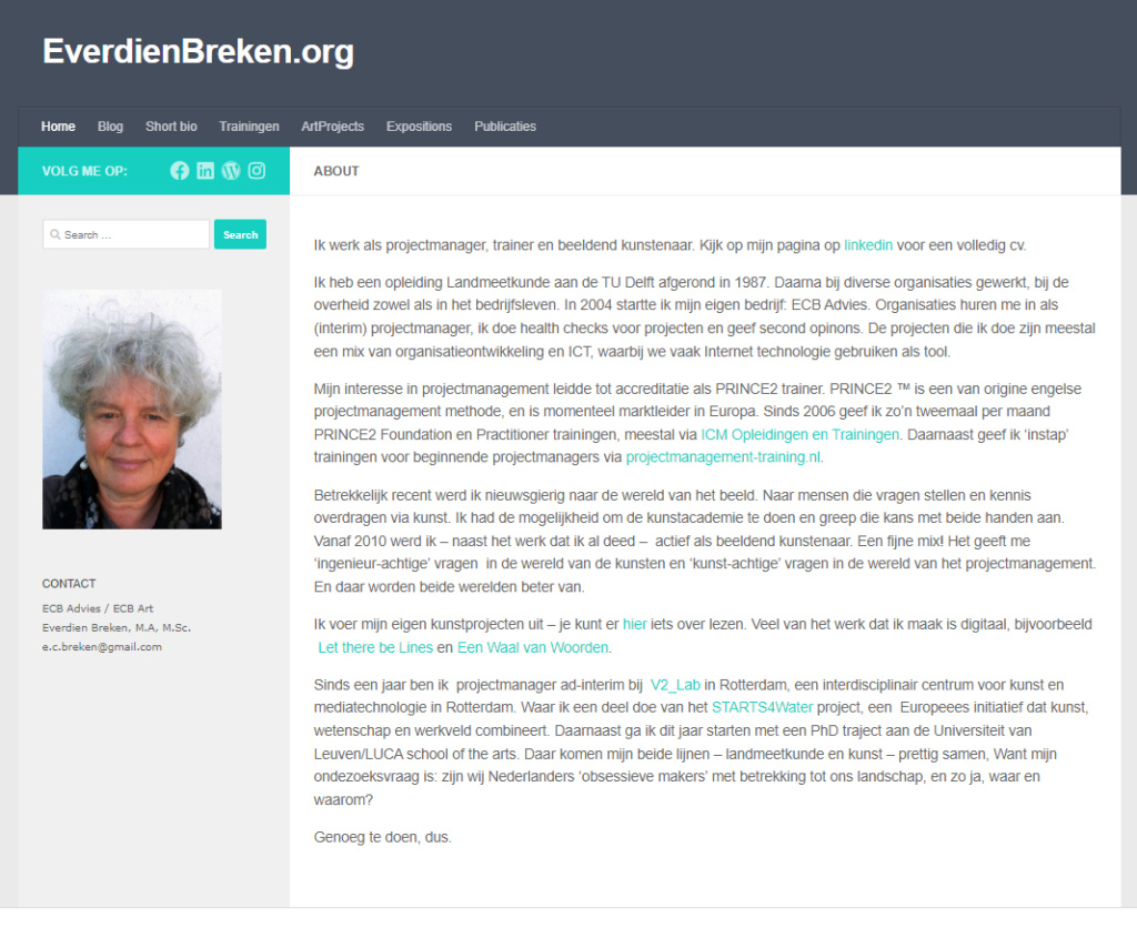
There is my ‘visiting card’ website [everdienbreken.org] that is to be short and to the point and businesslike – target audience is people I work with in projects and people I teach. So I restyled it and made it more to the point.
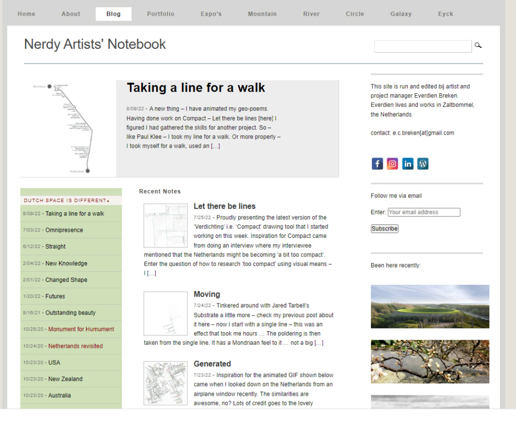
It links lightly to this ‘nerdy artists notebook’, which I gave an update as to look and feel. Nothing radical, just connected the separate elements better and made sure all has the same look and feel. I write and collect stuff here to keep track of my artistic activities and help myself make sense out of them.
Then there is this new notebook, which is meant for note-taking and cross-linking notes and facilitating my thesis-writing – once that day has dawned …
I briefly considered yet another site for my photography, but shelved that for now. There might not be such things as ‘too rich’ or ‘too thin’ for a woman, but ‘too many blogs to maintain’ is a distinct option :)
To be honest, I did burn the midnight oil working on this. Especially consolidating and pruning all the nifty things I did with this notebook over the years cost some time … managed to keep all functionality and style things in a more uniform way. Anyways, lots of fun has been had.

| « Taking a line for a walk | <-- previous post | next post --> | Timing » |
|---|


