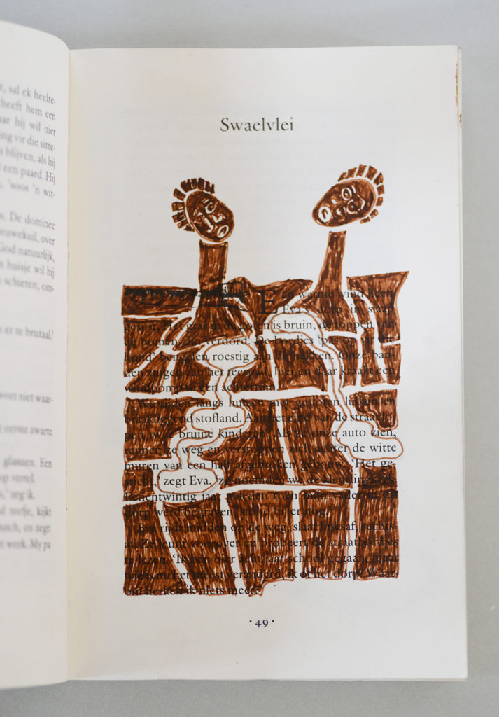
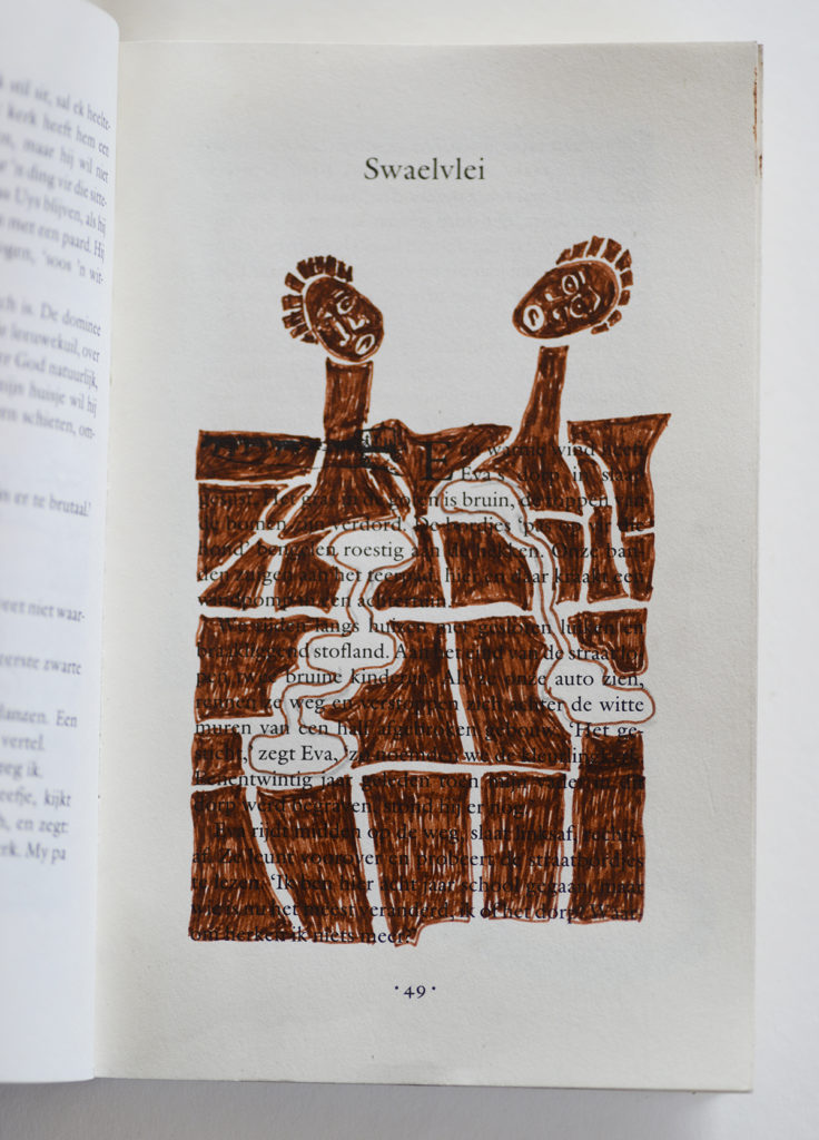
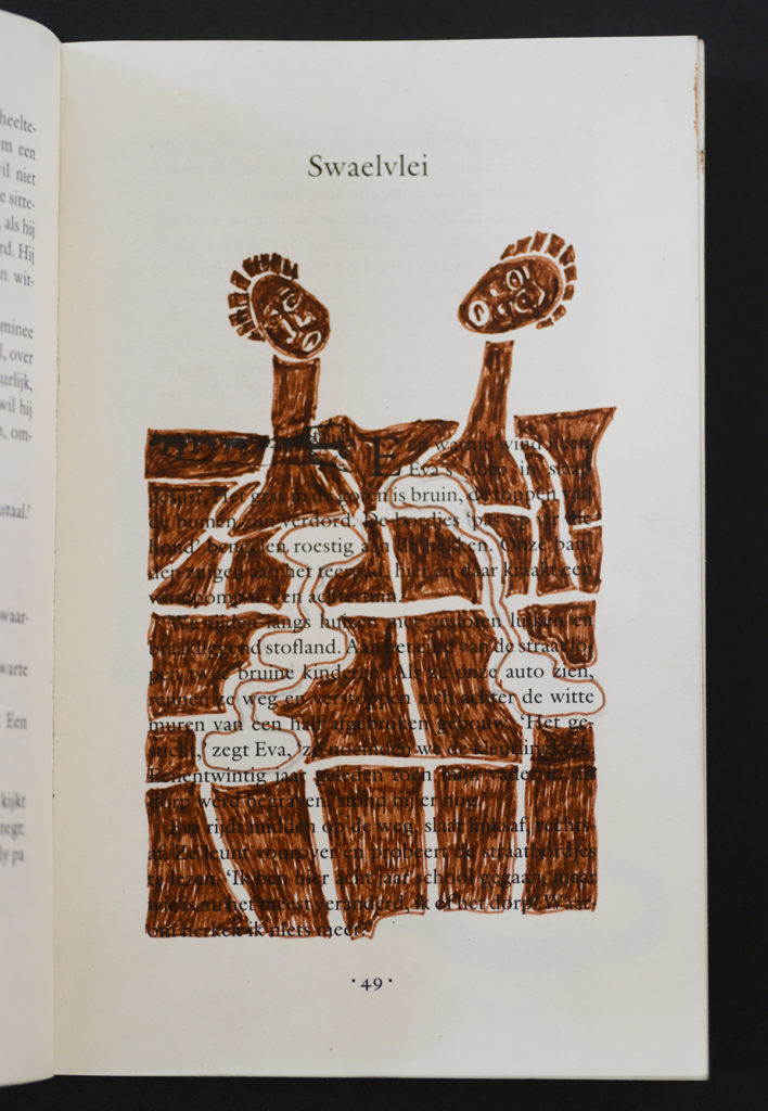
And tried again again .... Ok, black and white wins.
Dither
Am working on photographing my travel journals today. Had a lovely walk through town, sunny weather up until now, much against the weather predictions so to be savoured especially. Scored white, grey and black A3 paper to be the background of my photo’s. I love living in – and walking through – my small town.
So what looks better – white, gray or black for background? It isn’t me to dither. And dithering I am.
Later: okay, grey it will be. Grey tones up the white of the book, also it is more neutral. White has problems with shadows. Black is too harsh.


| « Captured | <-- previous post | next post --> | The promised land » |
|---|


